
Creating “shelfie-worthy” bookshelves might seem like an easy task, but even the pros agree, it’s tougher than it looks.
“The challenge is that there are no hard-and-fast rules for designing a great shelf,” says Myra Murias, former home stylist for West Elm in Calgary. For her, it’s mostly about trusting her intuition.
The same goes for Katie Rioux, interior decorator and owner of Decorating Den Interiors. “It involves a lot of stepping back, eyeballing and rearranging,” says Rioux.
For those who lack that intuition, here are some basic guidelines to help you curate and transform bland ledges into photogenic spaces that will warrant Instagram likes.
Focus on a feeling
Myra Murias advises to start by removing everything from the shelves, then determine what kind of feeling you want in the space.
“You have to figure out what your personal tolerance is for chaos and clutter,” says Murias. “If you have a low clutter tolerance, then you may want grey, cream and silver for a calm, relaxing look. Other people could have things all over the place and that looks awesome to them.”
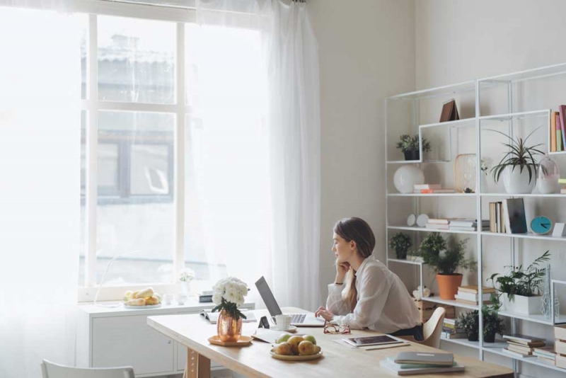
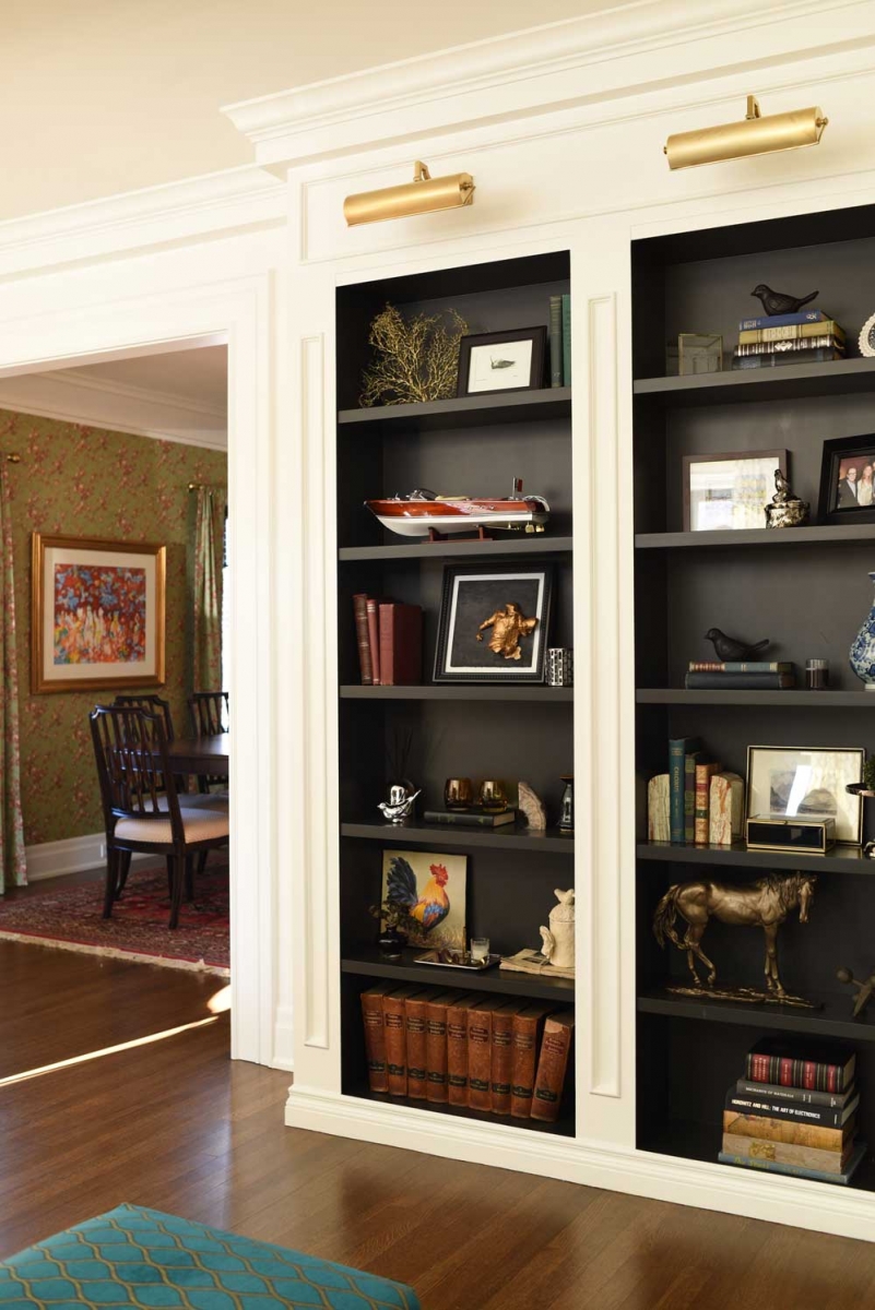
Danielle Burns is one of those people with a very low tolerance for chaos in her space.
In her immaculate home office, she has styled dark chocolate bookshelves with favourite novels and art and history books, and accented with silver-framed family photos, a silver cigar-box that belonged to her husband’s grandfather and a silver pocket watch she gave to her husband on their wedding day.
“This is my work space and I want to be surrounded by things that make me happy,” says Burns, “but I don’t want too much. I feel like too much stuff makes my mind cluttered.”
Vary texture and height
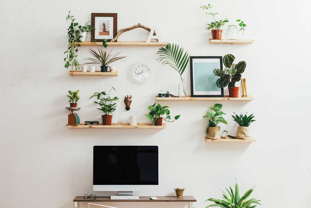
You can create depth by layering your display items to create visual interest. Lean a painting or an attractive tray against the back of the shelf, then place a smaller piece of artwork in front and complete the grouping with a glass vase in front of that.
Vary the heights and textures of display objects, especially in a grouping. Ideally, you should group items in odd numbers.
“If you want the grouping to look cohesive, it’s nice if there’s one thing that unites all of them,” says Murias. “That’s what makes it look like it has purpose.”
In the case of three pictures, all the frames could be different materials and sizes, but the unifying factor could be that they are all black-and-white photos – or the frames could all be metallic or the mats could all be white. Assembling three white vases of varying heights and textures also makes an attractive grouping.
“Varying the heights will keep your eye moving rather than keep it stagnant in one space,” says Katie Rioux.
Space out
Just as the “rest” (that breath of silence) is important in music, so is the space between objects. “That’s the other mistake people make – they don’t have quiet spacing or what we call negative space,” says Murias. Instead, people often put too much on their shelves, she says. “When you have a little grouping to one side, leave some space, then put a stack of horizontal books or a little topiary just by itself.”
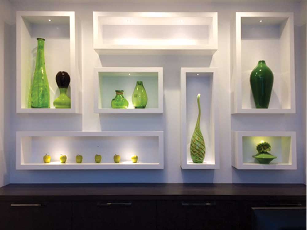
Irene Chen took negative space to another level, designing a staggered assortment of individual box shelves to give pause between each of her favourite vases and objects. As a result, each cheery Granny-Smith-apple-green item is framed and spotlighted in a showcase of its own. “I didn’t want the typical shelves for books and stuff,” says Chen. “I wanted it to be like a gallery.”
Colour
For Rioux, accessorizing shelves begins with a colour palette. “It’s important to have some sort of colour you’re drawing from in the room,” she says. “You want to determine your colour palette and repeat it throughout.”
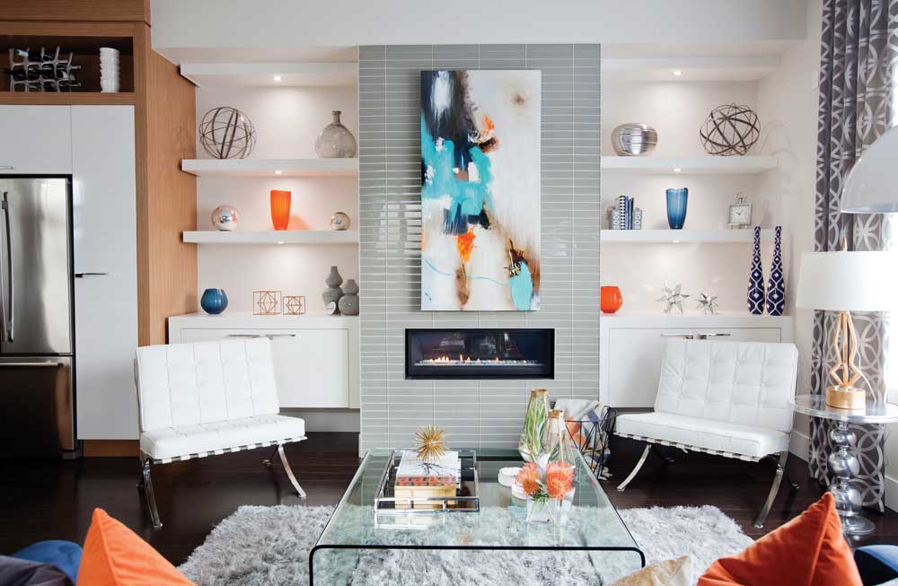
In her own home studio, Rioux selected a few bright blue and orange vessels for her shelves matching the tones in the modern artwork that is the focal point in the room (left).
By contrast, Sue Han’s 89-year-old home is blanketed in a serene, neutral palette with white shelves flanking her white brick fireplace.
“Because my house is really white, [the shelves] are one area in the room where I can play around with colour and texture” says Han, an interior designer. “Knick-knacks can look messy but I like to curate just enough so it adds another dimension to my house.”
Mix it up
“Too much of one thing is not a good thing,” says Rioux. “It’s important to get a variety of different things – anything from books, sculptural objects, trays, pictures, vacation mementos.”
Avoid filling shelves with the same types of items such as only framed photographs or all vases or too many plants.
The exception is books, says Rioux. Still, she notes that filling the shelves with books may not work for just any room. “You would be more apt to see that in an office or a study versus your living room.”
Personalize
In all the talk of selecting items it can be easy to forget that your display items should reflect your personality and be meaningful to you.
For example, in Lamise Kochorek’s home, one shelf is occupied by Lego. “My son went through a phase when he was crazy about Lego so we got the Architecture series and he built them and we have it on display because it’s reflective of what we do,” says Kochorek, owner of Calista Homes Ltd.
On another shelf sits an antique radio that she picked up from a pawn shop 30 years ago.
“You need something used, with a bit of life and soul to it, which is something antiques have,” says Murias. “They just have an energy and soul to them.”
Balance
Whether you’re aiming for a symmetrical or an asymmetrical look, all of the tips given here can help to create balance.
“Symmetry can be great for a calming feeling, if you like things very orderly,” says Rioux. “Asymmetry just kind of shakes things up. People are [increasingly] becoming fans of that eclectic feel.”
To attain asymmetry success, keep in mind the visual weight of objects, making sure one item’s proportion isn’t overpowering another’s. A small, dark item will look heavier and dominate a space more than a large transparent or lighter-coloured object.
“Don’t concentrate all one colour on one shelf,” says Murias. “[Having said that], a whole wall of all whites, creams and silver could be really beautiful, too.”
Which is to say, that in the end, it’s still a bit about intuition, and individual taste.
“Put your stuff on the shelf, stand and stare at it for about 10 minutes – live with it for a bit,” says Murias. “Do that, and if you’re happy with it, then it’s good.”