
The Blues
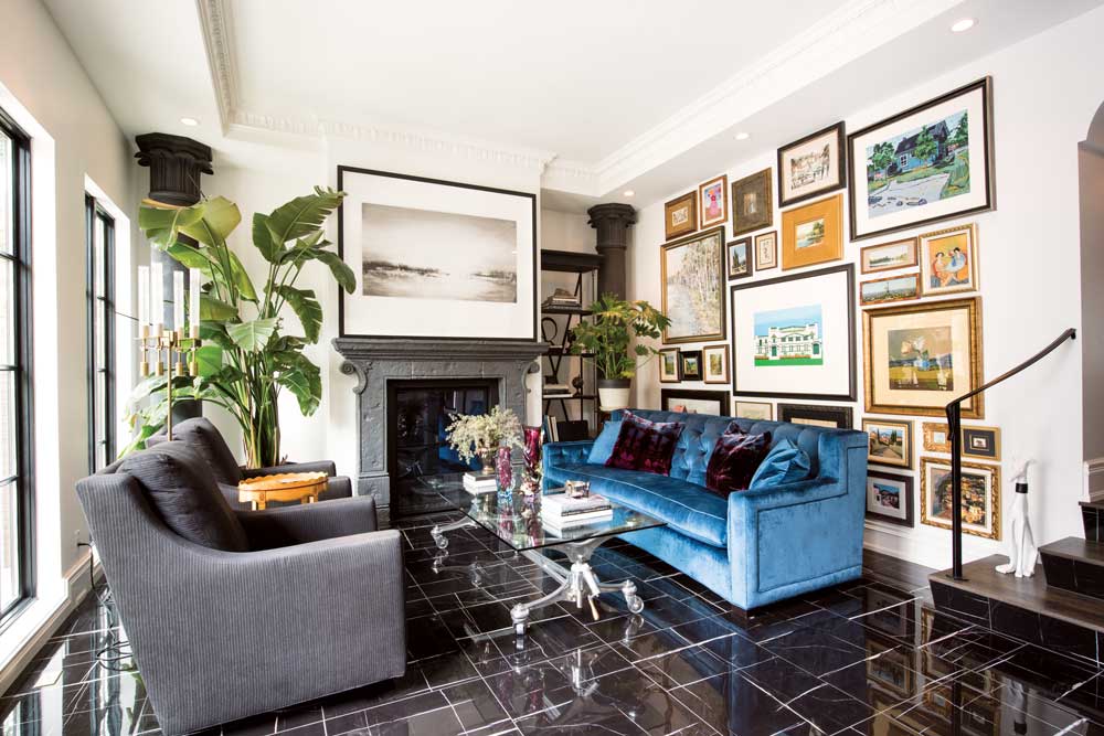
photograph by jared sych
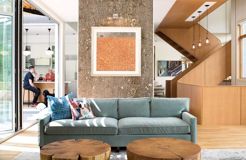
A move away from minimalism can be seen in bold colour and rich fabrics such as the blue velvet couch here in this interior designed by Karen Ryan.
Looking to introduce a little colour into your world? Time to get the blues. “Blue is a natural colour,” says Emily Sissons, director of design and sales at Domaine Furnishings (a family-owned-and-operated business marking its 10-year anniversary this month). “It’s related to the ocean and the sky. It can go from very sophisticated to very serene.”
Deep blues, specifically navy blue, can be easily integrated into existing decor or, if you’re eager for a redesign, used as a starting point. “You can look at blue, quite literally, like a good pair of blue jeans,” Sissons adds. “You can dress it up or dress it down.”
Julian Riley, co-owner of Maria Toms Indoor and Outdoor Living agrees. “A deep blue is a neutral in some ways. For interiors, you’re going to be more into the royals and navy because that pairs very well with the gold metals.” And, while black and gold are also on the rise, Riley says mixing that gold instead with a deep blue or deep green takes it to a different level.
If blue isn’t your colour, there’s still plenty of room to go bold. Riley says grey remains a dominant design choice. It might be a darker, smokier grey, he adds, but you can pair in jewel tones in accessories and finishes – and not just in blues and greens, either. “It’s more about the saturation level of a colour,” Riley says. “There are reds. There are pinks.”
An offside colour taking the spotlight these days is a sort of blush pink (often dubbed “millennial pink”). “In the ’80s pink and grey were very popular and you are seeing a bit of that coming back,” Riley says. “Mix pink in with warm walnut woods, with some yellows and oranges in there as well.”
Bold jewel tones are commonly seen in heavier velvet fabrics. “The pendulum has swung so far toward that very minimalist, clean, mid-century look, that you’re going to start to see a swing back,” Riley says.
Get the look
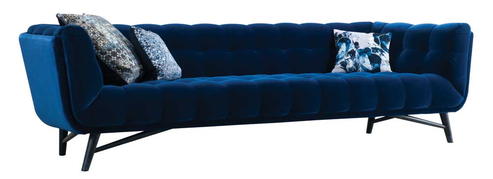
photograph supplied by roche bobois
Nouveaux Classiques collection from Roche Bobois.
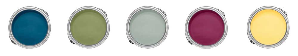
photograph supplied by canadian tire
Royal Knight, Endive, Blue, Spruce Mixed Berry pie, Lemon Loaf. Premier Infinity paint from Canadian Tire.
Black & White
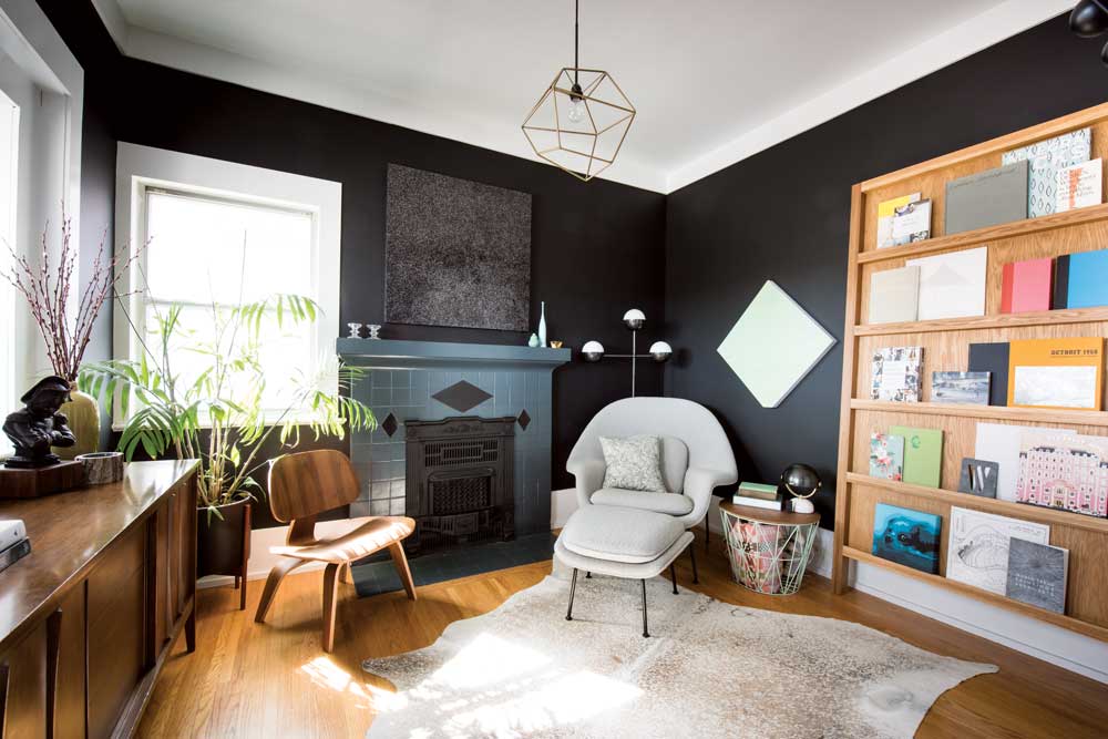
photograph by jared sych
Warm walnuts and oatmeal tones make a good base for dramatic black-and-white decor, as in this study designed by Sarah Ward.
Black and white can bring to mind an art gallery. “It’s very stark, very cold,” says Julian Riley from Maria Toms. The way to warm up black and white is to start with a neutral palette, Riley says, such as the warm walnuts and oatmeal tones of the mid-century trends of years past.
At the Paris design show Maison & Objet, Riley says he noticed black replacing grey when it came to accessories. While entire rooms of black and white are unlikely to catch on, he expects to see more inexpensive approaches such as black feature walls becoming more common. “You’ll see a return to picture frames being black. You’ll find a lamp with some black on it.”
The black-and-white pairing can also be layered into a space with a more vibrant palette to balance it out, says Domaine’s Emily Sissons. “It’s classic, but it can also bring a really mod/luxe touch to a space that needs a bit more sophistication,” she says. While clients are often hesitant to go big and bold with colour, they tend to be attracted to the timeless nature of black and white. “You can switch up [colours] with cushions and art, but black and white are just so timeless,” Sissons says. “People aren’t afraid of that.”
If you’ve updated to a jewel-toned couch, take the advice of Jordan Bondar of Bondars Furniture (which marked its 25th year in its current location last July) and pair it with black-and-white artwork. “Take that deep velvet couch and put all of your black and white art above it,” says Bondar, who also manages Home Evolution with her family. The key is not overdoing it on either end of the spectrum, but rather creating a balance between your blacks and whites and vibrant colours.
Sissons agrees, “Our advice to clients: have black somewhere, just to anchor the room.”
Get the look
photograph supplied by roche bobois
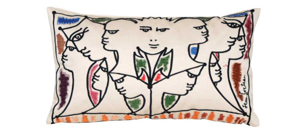
Petit Visage – Jean Cocteau cushion from Roche Bobois.
photograph supplied by home evolution
Obstacle Course artwork from Home Evolution.
Wall Treatments
photograph by jared sych
Home designer Jeffrey Riedl installed pressed-bark as a wall covering in a client’s home.
Doing something to a wall that goes beyond paint tends to feel so, well, permanent. Most everyone has less-than-fond memories of scraping away at an expanse of wallpaper with no end in sight. According to Julian Riley of Maria Toms, however, those bad memories can stay just that – memories. With the advancements in today’s wall treatments (and having those treatments applied by professionals), there’s really nothing to fear. In other words: “this ain’t your grandmother’s wallpaper.”
Suppliers such as Robert Allen have even come out with fabrics that can be applied to the wall like wallpaper, and are typically just as easy to remove. These large-scale treatments can help create visual tension in a room that might contain fewer furniture items. “A big panel of fabric or wallpaper becomes art, especially if it’s in a larger-scale pattern,” Riley says.
Natural materials and fibres are another trend in wall treatments. Robert Pashuk, of Robert Pashuk Architecture says this is connected to the movement built around the concept of hygge (pronounced HOO-gah), a Danish word which describes the quality of coziness and comfort that engenders a feeling of contentment or well-being. “If anything, [hygge] goes back to natural materials and fibres,” he says.
Designer Jeffrey Riedl, who co-owns Pomp & Circumstance with Pashuk, agrees. “We’re typically doing more of a natural feature wall,” he says, one example being the pressed-bark feature wall Riedl had installed in a client’s home last year.
For a simple but impactful return to nature, Domaine’s Emily Sissons suggests creating a feature wall using grasscloth, which she describes as “organic and approachable.” The textural quality of grasscloth maintains a flexibility that allows for layering with everything from fuchsia pillows to a patterned carpet. Installed the proper way, grasscloth also has the flexibility to be easily removed when you’re ready for a new look down the road.
Get the look
photograph supplied by Maria Toms
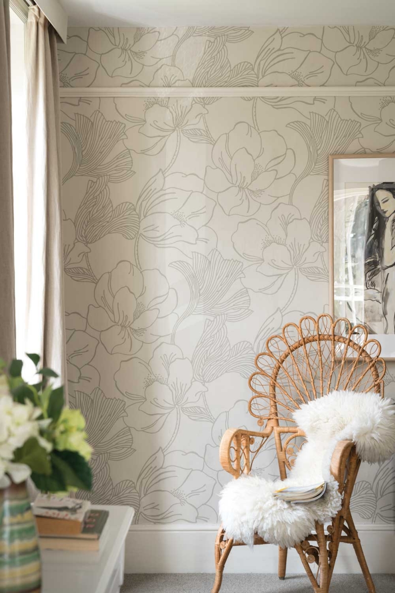
Farrow & Ball, Helleborus wallpaper, (available to order from Maria Toms).
>Bold & Mosaic Tile
Done thoughtfully and intentionally, tile can transport you across time. “We’re seeing a connection with not quite Old World, but older styles and tile patterns that may have come from Europe,” says Domaine’s Emily Sissons. “[Tile] is like a beautiful found material that you’ve brought into your home.”
Julian Riley of Maria Toms notes that at places such as Uniquities, a local seller of architectural salvage, “you can buy whole floors from French chateaux.” Like all good design, however, tile is best used to a point, especially as trends shift from tiny, glass mosaic tile to larger-format, patterned tile. “You want to use these things sparingly, so they still seem special,” Riley says.
Robert Pashuk also warns that there is risk in using graphic tiles. “You have to be careful with how graphic you go with tile because it’s a hard element to change,” he says, noting that anyone who has purchased a house built in the 1970s (a heyday of graphic tile) knows how challenging it can be to remove. Pashuk is less apprehensive about the trend toward more interesting shapes of tile, such as hexagons, chevrons and, most prominently, trapezoids. In these cases, the bold effect is achieved by the combination and distribution of the tile, rather than the graphic.
Sissons notes that both distribution and scale speak to the essence of how tile works within a space. “If you have just a small morsel of tile in one little area, it may look so under-scale that it has no impact. When you play with scale and do a whole surface in something, it’s like an illusion,” she says. “The space looks bigger.”
Still tentative about tile? Jordan Bondar advises starting with a small space, such as a powder room, where tile can make a big impact.
Get the look
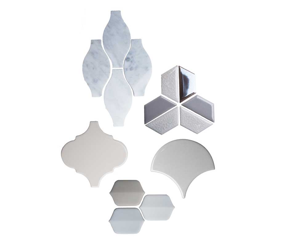
photography by jared sych
CLOCKWISE FROM TOP LEFT Ames Tile & Stone Rockford Marble series teardrop in Bianco Cararra; Tierra Sol Arvex Glaze Craze series blast mosaic in Lotus Pearl; Saltillo Tile HP Fan series in light grey; Ames Tile & Stone Vetro D’Terra Mosaic series elongated hexagon in Carrara; Euro Ceramic Tile Alhambra series arabesque in cream, all available at CDL Carpet & Floor Centre.
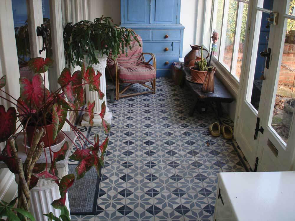
photograph supplied by uniquities architectural antiques
Antique French encaustic tile floor from Uniquities Architectural Antiques.
Phased Redecorating
You may be ready to overhaul your home decor, but it’s probably best not to put the sofa out on the curb without a plan and, well, a little financial foresight. Julian Riley says the practice of phased decorating is a mantra at Maria Toms, especially during times of economic recession. When clients come in saying they’re looking for “just a sofa,” it’s never really just a sofa – a little backtracking usually reveals plans to do the dining room or a bedroom, as well. Rather than one space or piece at a time, it’s better to see redecorating as a cohesive plan: focus on one area but keep the others in mind so the design will flow and feel connected.
Emily Sissons has had similar experiences with the clientele at Domaine, a family owned and operated business that marks its 10th year in business this month. The team there encourages clients to be mindful in planning the entire project, even if they want to start in one space. “We’re following a concept from the get-go,” Sissons says. “We’re still hitting those key design elements in each room and being mindful of where we started and where we need to finish.”
Along with being easier on your credit, phased redecorating is a more thoughtful and curated process, says Jordan Bondar. “You need to find those special pieces to make your house your home, and that doesn’t happen overnight.”
If your goal is a total redesign, be considerate of timelines when it comes to planning. “We’re not talking a 10-year plan, because that’s not realistic,” says Riley. “Generally, it’s going to be two-to-three years, at most.”
“We usually say do it in three-month chunks,” says Sissons. “We’ll sometimes plan an entire space or home for our client, and they’ll go ahead and order, but we’ll delay the shipping so that things can come in phases.”